SVG and CSS icon usage#
At DNB we are using Streamline icons as our source for off-the-shelf vector icons.
Using Icons#
The icons are in SVG format and are optimized for performance and to have the smallest footprint possible in the package build process.
The sources are included in the @dnb/eufemia package and published as public
stable and immutable CDN files.
For example:
https://assets.eufemia.dnb.no/v11.14.1/icons/dnb/home.svghttps://assets.eufemia.dnb.no/icons/dnb/home.svg
They also exist as React Components to be easily integrated, without the need of an additional SVG file loader.
Icon color#
Eufemia SVG icons simply inherit the current color. In case you do not use the Icon component, you have to handle colors yourself.
For icons that communicate a state, follow the status icon pattern for sizing, semantic colors, dark mode and accessibility.
Change SVG border color#
.selector svg {color: var(--custom-color);}
Example color usage#
color: var(--custom-color);.selector svg {color: inherit;fill: currentColor;stroke: currentColor;}
Sizing#
Eufemia icons come in two sizes:
- Default Size 1.0rem with 1.5px stroke weight
- Medium Size 1.5rem with 1.5px stroke weight
The reason there are two sizes is mainly due to the SVG artifact that the icons, alongside the strokes, will scale up once we use them with a larger width and height.
Scalability in web#
To ensure that the relative size of the SVG icons is scalable by the inherited CSS font size, do not explicitly specify the SVG.
Example size definition by CSS
font-size: 1.5rem;svg {width: 1em;height: 1em;font-size: inherit;}
Spacing#
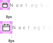
Icons should have a minimum area of 8px between them and their nearest neighbor.
Custom Icons#
Streamline caters to pretty much all of Eufemia's icon needs. However, sometimes there is a need for a custom icon. In these cases please contact one of Eufemia's design leads.
Primary icons#
The Primary Icons are used inside Eufemia components and are also bundled as a UMD Package.
Primary Icons can easily be defined and included in components, for instance, in Buttons. They are integrated by using the IconPrimary component.
React example usage#
<IconPrimary icon="bell" size="medium" /><Button icon="chevron_right" />
You can also import them like the Secondary icons:
import { bell_medium, chevron_right } from '@dnb/eufemia/icons'<Icon icon={bell_medium} size="medium" /><Button icon={chevron_right} />
Browse the shared icon catalogue and use its primary filter.
Secondary icons#
The Secondary Icons are an addition to the Primary Icons. They extend the possibility to have more icons that are not primarily used. They do not ship integrated, as the Primary Icons do.
The Secondary Icons can be extended infinitely.
Technically: As a consequence, they have to be imported wherever they are used.
Importing secondary icons#
import { hamburger_medium as HamburgerIcon, bubble } from '@dnb/eufemia/icons'<HamburgerIcon />/* <-- is not recommended, but possible */<Icon icon={HamburgerIcon} /><Button icon={bubble} />
Browse the shared icon catalogue and use its secondary filter.
Other component icons#
Some icons belong to a component rather than the shared catalogue.
Use the FormStatus icons only#
InfoIconSuccessIconWarnIconErrorIconMarketingIcon
import { InfoIcon } from '@dnb/eufemia/components/FormStatus'render(<InfoIcon />)
... or in combination with the Icon component. Have a look at this example.