What you should know before getting started
Before you get started, there are some technical decisions you should know about—as with every project.
Table of Contents
- What you should know before getting started
About technology
The library consists of React components. The newer components are written as functional components with React hooks. This was added to React version 16.8 and has become the new standard of React.
Components are written in TypeScript.
Components are styled using nested CSS class selectors with SASS (SCSS) and BEM (Block Element Modifier).
Eufemia is a Mono Repository
The Eufemia repository is a monorepo consisting of the following workspaces:
- dnb-design-system-portal: Source code of the portal website - this website.
- dnb-eufemia: Source code of the npm package - where all the components are located.
dnb-eufemia
The only folders you should need to know about to add new features are:
src/components: The folder containing all the components, structured in component folders.src/extensions: The folder containing all extensions, also structured in component folders.
dnb-design-system-portal
The documentation in markdown (MDX) is located at src/docs and the portal will automatically create pages and menu items based on that current structure.
All you need to do to add a new page is to create a new markdown (.mdx) file within one of the folders. All documentation for components and elements are located at src/docs/uilib, which corresponds to the URL eufemia.dnb.no/uilib.
Configuration files
ncurc.jsonis used to ignore certain dependencies during a dependency update made by npm-check-updates..eslintrcis a file with configurations to ESLint, which is a tool for identifying and reporting on patterns found in ECMAScript/JavaScript code, with the goal of making code more consistent and avoiding bugs..prettierrcis a file with configurations to Prettier, which is a code formatter for multiple languages..stylelintrcis a file with configurations to stylelint, which is a linter for styling (SCSS/CSS).babel.config.jsconfigures Babel, a JavaScript compiler.jest.config.jsconfigures Jest, the JavaScript Testing Framework for this project.jest.config.screenshots.jsconfigures jest-image-snapshot, which is related to the screenshot testing (visual assertion).tsconfig.jsonis a file with configurations to TypeScript.
About Types
The two main purposes of delivering TypeScript types are:
- Inline property documentation
- Property validation and type safety
Components are written in TypeScript (.tsx).
Shared Properties docs (legacy)
If you have one /properties.md file, but e.g., two components share most or all of the properties—like a component and a provider for that component (Accordion and AccordionProvider)—then you can define both components in the markdown table header name. You can then provide a second table with more specific properties for a second component.
#### Properties| Accordion and AccordionProvider Properties | Description || ------------------------------------------ | --------------------------------------------------------------------- || `id` | _(optional)_ docs. || [Space](/uilib/layout/space/properties) | _(optional)_ spacing properties like `top` or `bottom` are supported. || AccordionProvider Properties | Description || ---------------------------- | ----------------------------- || `expandedId` | _(optional)_ expandedId docs. |
About component structure
Eufemia has a couple of common parts, so every component behaves consistently:
- Locale support.
- Provider support for centralized property forwarding.
- Spacing support.
- Skeleton support.
- FormLabel / FormStatus support if it's a form component.
- Automatic id generation and linking of HTML elements to enhance accessibility.
- Handling of
aria-describedbywithcombineDescribedByetc.
How to add support for each of these is explained in Additional support - Getting started.
Component folder
Every component and extension should have a similar structure, as described here.
As an example, we show the folder structure of component Breadcrumb. You can also check out the source on Github.
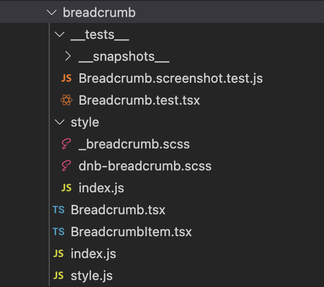
/__tests__: Contains the tests (Breadcrumb.test.tsx) and screenshot tests (Breadcrumb.screenshot.test.tsx) for the component. All screenshots will be placed within the folder__snapshots__./style: Contains the styling of the component. The file_breadcrumb.scssdefines all styling using BEM.dnb-breadcrumb.scsscontains the component style exports.Breadcrumb.tsxandBreadcrumbItem.tsx: The React components for the Breadcrumb are defined and exported from these files.index.js: Contains component exports.style.js: Contains component style exports.
Modifications
- Adding theming files under a folder
style/themeswill unlock the possibility of having different themes in the future. Check out the source for theming in Button.
Development environments
There are a couple of environments for different purposes.
- For developing and styling new components, you can run Storybook development.
- For writing documentation and displaying the components, you can run the portal locally.
- After development, you can run your tests.
- If you want to see the local changes in the search results, you can run Algolia search queries locally.
Storybook development
Storybook is used for quick examples and component development. They do not need to be perfect.
Stories are placed inside a /stories directory and contain .stories in the filename: /components/button/stories/Button.stories.tsx
Run Storybook locally by running
yarn dev
in the root folder. Then you can view the Storybook website by visiting localhost:8002.
Add new pages to the storybook by adding a new directory /stories and a new file under ComponentName.stories.tsx and following the similar structure of the other files.
Eufemia portal
The portal is handled by Gatsby, a framework for building pre-rendered SSR websites.
Run the Portal locally:
$ yarn start
This will start the Portal. You can view the portal website by visiting localhost:8000.
Content changes to both Markdown (MDX) files and styles (SCSS) and code changes will be reflected immediately.
For a faster startup-time, you can decide what pages you need by using the environment variable filter e.g.:
$ filter=button yarn start# - or –$ filter=button,/input/ yarn start # with comma$ filter="button /input/" yarn start # with space (needs to be quoted)
And visit e.g. this page: http://localhost:8000/uilib/components/button/
Local build
In case you have to create a local static build of the portal website (for various reasons), you can do so by:
# In the `dnb-design-system-portal` directory, run:$ yarn build
The build will be exported to the /public directory. You can now also run a local static server to view it at the given port localhost:8000:
# In the `dnb-design-system-portal` directory, run:$ yarn serve
What happens in the build steps
During the build, various things will happen. First, a prebuild step before the build, and afterward a postbuild step.
During prebuild
$ yarn build
- Assets are getting generated
- All index and lib files are getting generated
- All the lib code gets compiled (ECMAScript 6 and ECMAScript 5.1)
- All SASS styles are validated and compiled (to support IE)
- Compiled CSS under
build/**/*.cssis parsed with Lightning CSS so invalid selectors (for example pseudo-elements not last in a compound selector) fail the build - All bundles get minified
- Icons are getting converted
To use the local build, you can either run the portal, or use yarn link to link the package with a totally different project.
During postbuild
$ yarn workspace @dnb/eufemia postbuild:ci
- Assets are getting generated
- All the lib code gets compiled (ECMAScript 6 and ECMAScript 5.1)
- UMD/ESM/ES/CJS bundles are getting generated
- TypeScript definitions are getting generated