About fields
Fields are the building blocks of the form components in Eufemia Forms. They are data-driven React components – named and structured – according to the "type" of data they can display and produce, based on the user's input and action in the interface.
Here's how you import the components from with the Field scope:
import { Field } from '@dnb/eufemia/extensions/forms'
Here is a list of all available fields.
Table of Contents
Base fields
These components are data-driven React components—named and structured—according to the "type" of data they can display and produce, based on the user's input and action in the interface.
- input category—which consists of field types that accept and produce values based on input from the user, such as text and numbers.
Field.ArraySelection
Field.Boolean
Field.Composition
Field.Indeterminate
Field.MultiSelection
Field.Number
Field.Option
Field.Selection
Field.Slider
Field.String
Field.Toggle
Field.Upload
- selection category—which consists of field types that allow the user to choose between a fixed set of values (options) represented by different UI components:
Field.ArraySelection
Field.Boolean
Field.Composition
Field.Indeterminate
Field.MultiSelection
Field.Number
Field.Option
Field.Selection
Field.Slider
Field.String
Field.Toggle
Field.Upload
- toggle category—which consists of field types that allow the user to toggle between two values, such as
trueandfalse:Field.ArraySelection
Field.Boolean
Field.Composition
Field.Indeterminate
Field.MultiSelection
Field.Number
Field.Option
Field.Selection
Field.Slider
Field.String
Field.Toggle
Field.Upload
On top of these, a number of feature fields have been built that have special functionality based on given types of data, such as bank account numbers, e-mails and social security numbers.
Feature fields
Feature fields are built on top of the base fields (listed above) to add more specific features targeting a given type of data.
More info
Empty value
Every field has an emptyValue property that can be used to define what value should be used when the user does not enter any value.
When a user removes its content from e.g. a string input field, the value will be set to the emptyValue.
- The default
emptyValuevalue isundefined.
When initializing fields from defaultData, providing an explicit empty value is optional; if you do, prefer the field's emptyValue (often undefined).
Standardized properties
All input components have a fixed set of properties that make it possible to build more complex standardized functionality around them. The most important ones here are value and onChange (can be async). Value expects values in the given data type, so for example, Field.Number expects a value of the type number, and will give a type error in TypeScript if it, e.g., receives a number in a string. The callback function submitted to onChange will always receive the value of the corresponding type as the first argument.
It is deliberate that onChange sends out the value from the field, and not the event object that comes from the actual HTML tag into which the user enters data. This is to create a less tight coupling between application code that uses the components and the internal implementation in the field components. In addition, this makes the surrounding logic simpler by not having to extract, for example, e.target.value everywhere.
The basic components have a number of properties that make it possible to control how they function in the interface, such as multiline on Field.String, which chooses whether to get one line of text (input tag) or several lines (textarea tag). In addition, they have a number of validation properties, such as minLength and required.
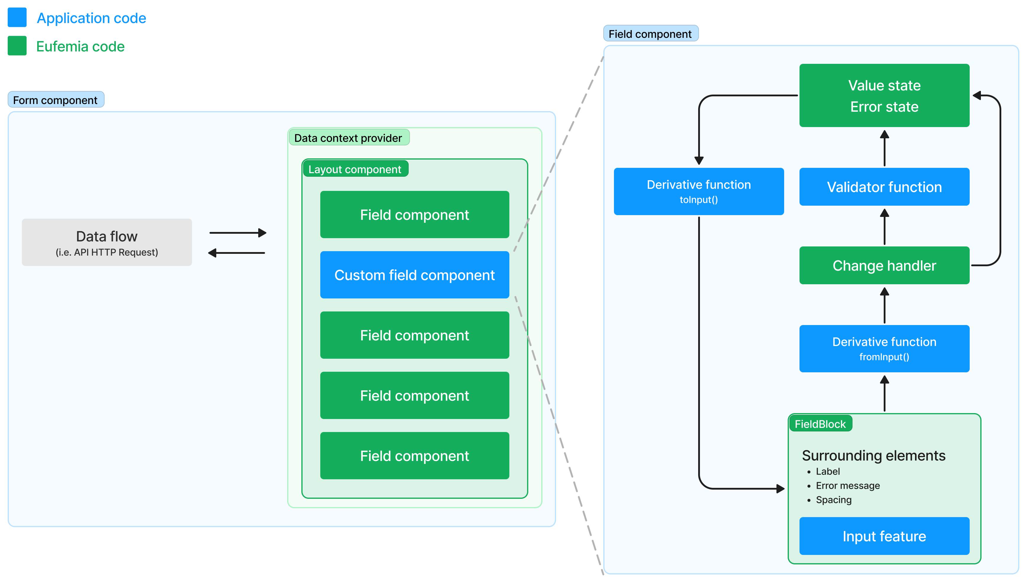
Inside a Form.Handler (or DataContext.Provider), fields connect to the surrounding data set with the path prop — a JSON Pointer such as /firstName. The path can be type-checked against your data model for autocomplete and compile-time errors on typos — see Type-checked paths.
Controlled & Uncontrolled
In React, it's important to be aware of where the states of a given set of data "lives". This can be an entire object that represents an entity the user is going to make changes to (e.g. a user or a bank account), but it also applies to the individual value a form makes changes to. A form field can be controlled or uncontrolled. The components in this package make it possible to work in both ways.
If the functionality is designed so that the state of the data will live outside the form components, you give the components a value and an onChange, and ensure that all changes that are sent out via onChange are fed back via value so that it functions as a controlled component. The internal logic in the components will then ensure that the value is kept the same via the changes it receives from the outside.
If you want the state of the value to live inside the input component, do not send the updated value in via value. The logic will then keep the internal value with the changes continuously, and still send the latest version with all the changes the user has made, even if they are not received continuously via value, as a basic <input> tag in React expects.
Creating custom field components
The useFieldProps hook that is used in all existing field components is exported to make it possible to create custom field components that have the same properties and follow the same flow as the standard components, without the need to recreate all the basic state handling features.
Basic field usage
Components in Eufemia Forms are very flexible. They adapt to the set of properties they receive, and you can therefore choose which parts of the functionality they should use, and what you yourself want to handle in the application code.
Here is an example that consists of a large degree of data handling in the application, even though the form itself still consists of both components from Eufemia and local special components (the blue boxes):
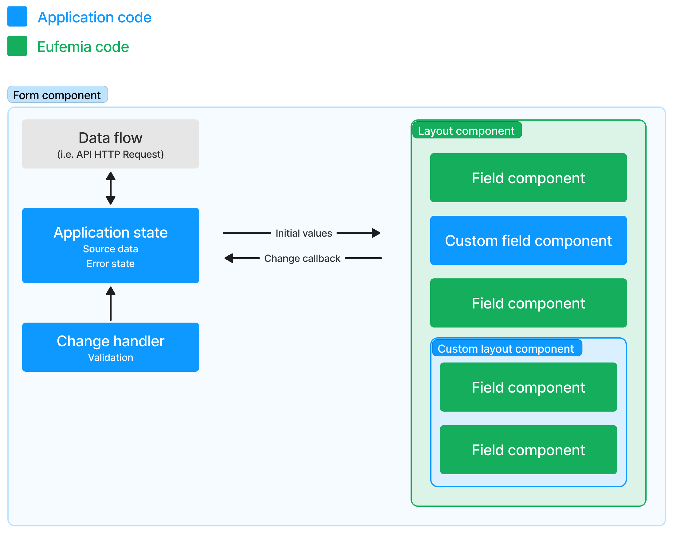
Complete state management and local custom fields
In this example, all state data, validation process and error handling are done by components from Eufemia Forms, inside a local field component created especially for this application. Here you find a combination of standardized field functionality taken from Eufemia Forms, and local specialized code to achieve the goal of maximum reuse without sacrificing flexibility:
First steps
You import the components from with scopes, such as Form and Field:
import { Form, Field } from '@dnb/eufemia/extensions/forms'render(<Form.Handler onSubmit={console.log}><Field.String label="Custom Field" /><Form.ButtonRow><Form.SubmitButton /></Form.ButtonRow></Form.Handler>)
More details in the getting started section.