Import
import { Dialog } from '@dnb/eufemia'
Description
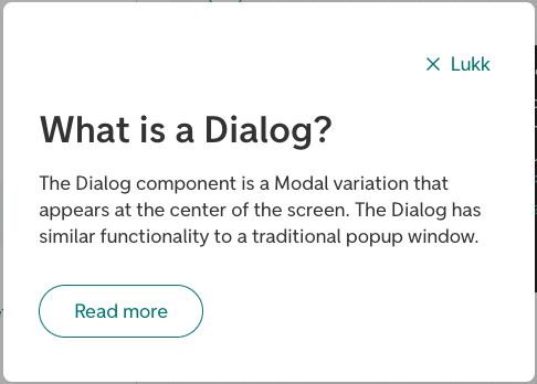
The Dialog component is a Modal variation that appears at the center of the screen. The Dialog has similar functionality to a traditional popup window. Similar to Modal, it has to be triggered by the user to appear. Typical usage would be to read an explanation, then close it.
Relevant links
Variants
There are two variants of the Dialog component: information and confirmation.
The informational variant (information) is used for informational purposes, for example explaining a word or something on the page. It has to be triggered by the user to appear. Typical usage would be to read an explanation, then close it.
The confirmation variant (confirmation) is used when some action is needed, or if we need to inform the user of something without them triggering it. A couple of examples would be a scenario where the user confirms deleting something, or if the user has been logged out automatically and we need to inform them, or a cookie consent dialog.
Parts in Dialog
To provide custom content to parts of the Dialog, a set of component parts are provided:
<Dialog.Navigation>: The navigation field at the top of the component, default with a close button (Equal to the propertynavContent).<Dialog.Header>: The header field of the component, where thetitlewill appear (Equal to the propertyheaderContent).<Dialog.Action>: An optional field for buttons at the bottom of the component. This field will appear by default for variantconfirmation.
More detailed information
For more details regarding the component functionality, check out the Modal documentation.
Root Element (React Portal)
The Dialog component uses PortalRoot internally through Modal to render its content. See the PortalRoot documentation for information on how to control where the portal content appears in the DOM, and for the BrowserTranslate helper when browser translation tools such as Google Translate should not modify content rendered through PortalRoot.
Related components
Dialog is part of the Feedback category. Other components for similar needs:
- AriaLive — to announce page changes to screen reader users.
- Badge — to highlight new, unread, or important information.
- Drawer — to show extra content in a panel that slides in from the side.
- FormStatus — to show validation errors, warnings, or messages near a form.
- GlobalError — to show a clear 404 or 500 error page.
- GlobalStatus — to show important page-level messages or a summary of form errors.
Table of contents
Demos for variant information
Basic Dialog
<Dialog title="What is a Dialog?">
  <P>
    The Dialog component is a Modal variation that appears at the center of
    the screen. The Dialog has similar functionality to a traditional popup
    window and is mostly used for informational purposes (for example
    explaining a word on the page). Similar to Modal, it has to be
    triggered by the user to appear. Typical usage would be to read an
    explanation, then closing it.
  </P>
  <Button variant="secondary" size="large" top="large">
    Read more
  </Button>
</Dialog>
Dialog as help button
<Input
  label="Input"
  placeholder="Placeholder ..."
  suffix={
    <Dialog>
      <P>Some additional information for the input field.</P>
    </Dialog>
  }
/>
Top aligned Dialog
<Dialog
  title="Vertical alignment top"
  verticalAlignment="top"
  triggerProps={{
    text: 'Vertical alignment',
  }}
  modalContent="The Dialog component is a Modal aligned at the top of the screen. The Dialog has similar functionality to a traditional popup window and is mostly used for informational purposes."
/>
Dialog with custom trigger
<Dialog
  title="Modal Title"
  trigger={(props) => (
    <Button {...props} variant="primary" icon="information">
      Custom trigger button
    </Button>
  )}
>
  <P>This Modal was opened by a custom trigger component.</P>
</Dialog>
Dialog with custom content
const handleBack = () => null
render(
  <>
    <Dialog title="Custom title">
      <Dialog.Navigation>
        <Breadcrumb onClick={handleBack} />
      </Dialog.Navigation>
      <Dialog.Header>
        <P bottom>This is in the Dialog header</P>
      </Dialog.Header>
      <Button bottom size="large" right top>
        Read more
      </Button>
      <Button bottom size="large" variant="secondary">
        Open example
      </Button>
      <FormStatus state="information">
        This is a formstatus in a Dialog
      </FormStatus>
    </Dialog>
  </>
)
Fullscreen Dialog
<Dialog
  title={<span className="dnb-sr-only">"Hidden" Dialog title</span>}
  fullscreen
  triggerProps={{
    variant: 'tertiary',
    text: 'Open a fullscreen dialog',
    icon: 'bell',
  }}
  modalContent="The Dialog component is a Modal variation that appears at the center of the screen. The Dialog has similar functionality to a traditional popup window and is mostly used for informational purposes."
/>
Dialog as progress indicator
<Dialog
  spacing={false}
  fullscreen={false}
  alignContent="centered"
  hideCloseButton
  triggerProps={{
    text: 'Show',
  }}
  preventClose={false}
  maxWidth="12rem"
>
  <ProgressIndicator showDefaultLabel top="large" bottom="large" />
</Dialog>
Nested Dialog
Open a confirmation dialog from within another dialog — for example to confirm a destructive action.
<Dialog
  title="Account settings"
  triggerProps={{
    text: 'Open settings',
  }}
>
  <P bottom>
    Review your account settings below. To permanently remove your account,
    use the button below.
  </P>
  <Dialog
    variant="confirmation"
    confirmType="warning"
    title="Are you sure?"
    description="Deleting your account is permanent and cannot be undone. All your data will be lost."
    triggerProps={{
      text: 'Delete account',
      variant: 'secondary',
    }}
  />
</Dialog>
Dialog with close delay
<Dialog
  title=".5s close delay"
  triggerProps={{
    text: 'Click me',
  }}
  focusSelector=".dnb-input__input:first-of-type"
  preventClose
  hideCloseButton
  onOpen={(e) => console.log('onOpen', e)}
  onClose={(e) => console.log('onClose', e)}
  onClosePrevent={({ close, triggeredBy }) => {
    console.log('triggeredBy', triggeredBy)
    const timeout = setTimeout(close, 500)
    return () => clearTimeout(timeout) // clear timeout on unmount
  }}
>
  <P>This is a Dialog with no close button.</P>
  <P>Click outside me, and I will be closed within 1 second.</P>
  <Input label="Focus" top>
    Focus me with Tab key
  </Input>
</Dialog>
Demos for variant confirmation
Confirm dialog
<Dialog
  variant="confirmation"
  title="Dialog confirmation title"
  icon={bell_medium}
  description="Some content describing the situation."
  onConfirm={({ close }) => close()}
  triggerProps={{
    text: 'Trigger button',
  }}
/>
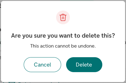
Deletion Dialog
A confirmType="warning" will enhance the context by applying a red color to the icon, as in the deletion scenario.
<Dialog
  variant="confirmation"
  confirmType="warning"
  title="Are you sure you want to delete this?"
  icon={trash_medium}
  description="This action cannot be undone."
  confirmText="Delete"
  declineText="Cancel"
  onConfirm={({ close }) => close()}
  triggerProps={{
    text: 'Delete record',
    icon: trash_medium,
  }}
/>
Dialog with a status message
Use the status property to display a status message as a FormStatus below the action buttons.
<Dialog
  variant="confirmation"
  confirmType="warning"
  title="Are you sure you want to delete this?"
  icon={trash_medium}
  description="This action cannot be undone."
  status="Could not delete the record. Try again."
  confirmText="Delete"
  declineText="Cancel"
  triggerProps={{
    text: 'Delete record',
    icon: trash_medium,
  }}
/>
Logged out Dialog
Use the open property to automatically trigger the Dialog, here demonstrated with a button for simplicity. You can also change the default confirm text and hide the decline button when suited.
const DemoComponent = () => {
  const [open, setOpen] = useState(false)
  const loginHandler = () => null
  return (
    <>
      <Button
        id="custom-triggerer"
        text="Manually trigger"
        onClick={() => setOpen(true)}
      />
      <Dialog
        variant="confirmation"
        title="Du har blitt logget ut"
        icon={log_out_medium}
        description="For å fortsette må du logge inn igjen."
        confirmText="Logg inn"
        hideDecline
        open={open}
        onClose={({ triggeredBy }) => {
          console.log('triggeredBy', triggeredBy)
          setOpen(false)
        }}
        onConfirm={() => {
          setOpen(false)
          loginHandler()
        }}
        labelledBy="custom-triggerer"
      />
    </>
  )
}
render(<DemoComponent />)
Cookie consent Dialog
Provide a custom set of buttons, like this cookie consent Dialog that has a tertiary "Administrate" button. Notice that the close function will be provided for every child of type Button given to Dialog.Action.
<Dialog
  triggerProps={{
    text: 'Show cookie dialog',
  }}
  icon={cookie_medium}
  variant="confirmation"
  title="Informasjonskapsler (cookies)"
>
  Vi bruker cookies for å gi deg den beste opplevelsen i nettbanken vår.
  <br />
  <Anchor target="_blank" href="https://www.dnb.no/cookies">
    Les mer om cookies
  </Anchor>
  <Dialog.Action>
    <Button
      variant="tertiary"
      text="Administrer"
      icon={edit}
      iconPosition="left"
      // @ts-expect-error -- strictFunctionTypes
      onClick={({ close }) => {
        close()
      }}
    />
    <Button
      text="Jeg godtar"
      // @ts-expect-error -- strictFunctionTypes
      onClick={({ close }) => {
        close()
      }}
    />
  </Dialog.Action>
</Dialog>