Import
import { Dialog } from '@dnb/eufemia'
Description
The Dialog component is a Modal variation that appears at the center of the screen. The Dialog has similar functionality to a traditional popup window. Similar to Modal, it has to be triggered by the user to appear. Typical usage would be to read an explanation, then close it.
Relevant links
Variants
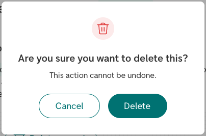
There are two variants of the Dialog component: information and confirmation.
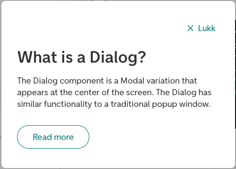
The informational variant (information) is used for informational purposes, for example explaining a word or something on the page. It has to be triggered by the user to appear. Typical usage would be to read an explanation, then close it.
The confirmation variant (confirmation) is used when some action is needed, or if we need to inform the user of something without them triggering it. A couple of examples would be a scenario where the user confirms deleting something, or if the user has been logged out automatically and we need to inform them, or a cookie consent dialog.
Parts in Dialog
To provide custom content to parts of the Dialog, a set of component parts are provided:
<Dialog.Navigation>: The navigation field at the top of the component, default with a close button (Equal to the propertynavContent).<Dialog.Header>: The header field of the component, where thetitlewill appear (Equal to the propertyheaderContent).<Dialog.Action>: An optional field for buttons at the bottom of the component. This field will appear by default for variantconfirmation.
More detailed information
For more details regarding the component functionality, check out the Modal documentation.